The Container and Grid System
In this series, building and designing a website will have three fundamental concepts:
- Mobile-first (or desktop-first)
- The container
- A grid system
All three of these concepts are built by adding special CSS classes to your HTML. More on this in the coming chapters.
Mobile-first
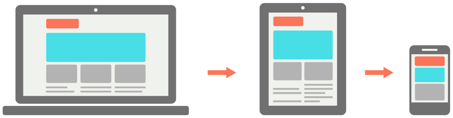
Have you ever visited a website on your phone and you have to zoom, scroll, click, and repeat because the website looks exactly how it’d look on your laptop? That website was not built with mobile users in mind, which typically indicates the website is dated.
Websites being built with mobile users in mind are the norm nowadays. As the name suggests, the website is built with the mentality that mobile users are the priority and that they should come first. This doesn’t mean you have you design the mobile interface before you design the desktop interface; just keep in mind how your desktop interface will look like on a smaller screen. In addition, Google has started placing mobile responsive websites higher in search results than non-mobile responsive websites.
The Container
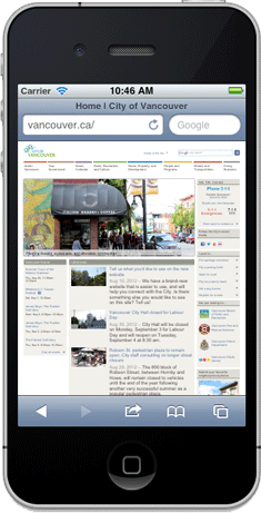
The container of a website is what defines how wide a website should be depending on the viewport. The viewport is what you see in your browser and its size is the size of the browser; regardless of the resolution of your monitor. For example, you can make your browser extremely skinny so the viewport will simulate a tablet or phone; this is actually how mobile websites are developed and can be tested. Make your browser skinny right now and you’ll see this page adapt.
On mobile phones and tablets, you typically want the container to take up 100% of the screen width where as on a desktop or larger screen, you may only want it to take up 992px or 1200px. These widths are defined by the container, which automatically resizes itself based on the viewport size. All of your website’s content will belong inside of the container but your entire website does not belong in the container.
In the following picture, the container is marked by the light blue lines. The text is the content of this page and it is placed inside of the container in order to prevent it from being stretched unreasonable on larger screens. However, the background image of the cables are not inside of the container because it is part of the design and it should be stretched on wider screens.

The Grid System
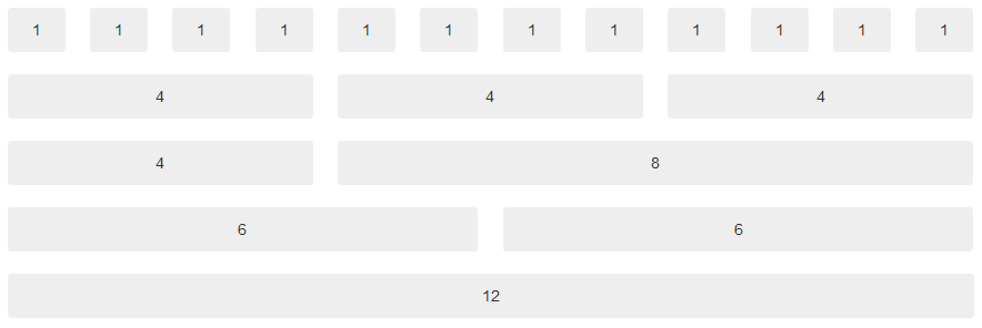
Popular frameworks such as Bootstrap and Foundation have made the 12 column grid system the de facto but you can increase or decrease the total number of columns; from my experience 12 is actually perfect.
As the name suggests, there are rows and columns in this system; rows are horizontal and columns are vertical, for the those who gets them confused (I’m looking at one of my editors on this one). When creating columns in the grid system, its parent must be defined as a row.
Example 1
Let’s look at creating the structure of a page with a sidebar. The actual content is where we want the reader to focus and so we give it the majority of the container.
We’ll be thinking about the desktop layout of this structure and then think about how to make it fit on a tablet and phone screen.
- First I define the parent element to be a
row. - On a desktop, I want the main content to have the majority of the page width, so I’ll decide to give it 8 columns of the 12; this means, I am left with 4 columns for my sidebar.
- On a tablet, I’ll give the main content 6 columns and be left with 6 columns for my sidebar.
- Finally, on a phone, I would like to have both the main content and sidebar take up the whole width of the screen; this is done by default and using the
.col-xs-12class is not necessary. On a smaller screen size, we can’t have a sidebar or else it’ll just look funny.
Here’s an example of how the above specification would look like in HTML using the Bootstrap framework.
HTML [Show Setup]
<style>
    #main {
        background-color: cyan;
        color: black;
    }

    #sidebar {
        background-color: red;
    }
</style>
<div class="row">
    <div id="main" class="col-sm-6 col-md-8">
        #main
    </div>
    <div id="sidebar" class="col-sm-6 col-md-4">
        #sidebar
    </div>
</div>
Output