Working from a Design (Floats & Positioning)
When working on a team with graphic designers or to create mockups, it is often faster and easier to create a website design with a tool such as Photoshop, Illustrator, or MS Paint. I recommend creating a wireframe or design before you even start writing code as changing something in Photoshop will often be far quicker and easier than rewriting an entire section of a website.
The first step to creating a website is to work on the layout and overall structure of the website by dividing it up into rows and columns, this is where a grid system comes into play. At the time of writing this, most grid systems are written with floats but soon, flex boxes may become the standard and after that possibly CSS columns.
For this lesson, we will be recreating the following image with floats and absolute positioning.
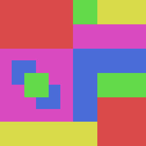
- Each square is exactly 50x50 pixels
- Here are the hex values for the colors
- Red: #DB4A4A
- Purple: #DA4DC1
- Green: #6DDB4B
- Yellow: #DADC4A
- Blue: #4A6CD9
Something to keep in mind is the fact that with code, there is never a wrong answer. There may be poor implementations or inefficient solutions, but that doesn’t mean it’s wrong unless it does not do what it’s supposed to do.
Let’s Get Started
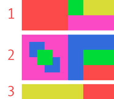
To begin, we our best judgement and split up the design into rows. Take note, with this example there are several different ways of setting this up but this tutorial will take you on only one of them with 3 rows.
To get started, we will need to create CSS classes that can be reused to create the individual blocks. We will have 3 different sets of classes:
.col-w-*- This class will define the amount of columns an element should span horizontally. Each column has a width of 50px so how ever many columns in the class will be multiplied by 50px; for example, the.col-w-3class will be3 * 50pxwhich gives us a width of150px..col-h-*- This class will define the height an element should span. The same math as the width columns apply here. You may think of this as the amount of rows an element spans but it does not equate to an actual.rowelement..color-*- This class will simply set the background colors of the elements
The .row class is used to maintain the width of this element and to keep all of the floated elements inside of the container. Floated elements will escape its parent container if the “clearfix hack” is not used.
When writing these classes, it is important to keep in mind to write as few classes as possible and ensure that they can be combined with other classes. In this example, to achieve an element that is 150px by 50px in size you would not want to write a class that has those dimensions hard coded; instead, you would want to have separate classes so the sizes can be reused. By combining two classes, you can achieve these dimensions and you’d be able to reuse one of those classes if you need to create an element that’s 150px by 100px.
width and height do not conflict and can work when put together. This approach does not allow you to use addition so you would not be able to combine two .col-w-* classes and expect to get the sum of them, instead you would just be overriding one of the values.
<style>
    .row { width: 300px; }
    .row:after { content: ""; display: table; clear: both; } /* Clearfix hack */

    /* Height classes */
    .col-h-1 { height: 50px; }
    .col-h-2 { height: 100px; }
    .col-h-3 { height: 150px; }

    /* Width classes */
    .col-w-1, .col-w-2,
    .col-w-3, .col-w-4 {
        float: left;
        position: relative;
    }
    .col-w-1 { width: 50px; }
    .col-w-2 { width: 100px; }
    .col-w-3 { width: 150px; }
    .col-w-4 { width: 200px; }

    /* Color classes */
    .color-red    { background-color: #DB4A4A; }
    .color-purple { background-color: #DA4DC1; }
    .color-green  { background-color: #6DDB4B; }
    .color-yellow { background-color: #DADC4A; }
    .color-blue   { background-color: #4A6CD9; }
</style>
First Row
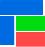
The first row we will be creating can be seen below; each of the colored elements will be referred to as a cell. First we must define that we want a row of cells so we start by creating an element with the row class, which is limited to 300px width. By limiting the width, floats will be automatically move to the next line if it does not fit in its parent.
The <div> tag is one of the most heavily used tags in HTML and should be used for divisions in layouts or to create “objects,” so to speak (more on this later). All HTML elements can use the class attribute, which has support for multiple classes being combined, delimited by spaces, as described above.
HTML [Show Setup]
<style>
    .row { width: 300px; }
    .row:after { content: ""; display: table; clear: both; } /* Clearfix hack */

    /* Height classes */
    .col-h-1 { height: 50px; }
    .col-h-2 { height: 100px; }
    .col-h-3 { height: 150px; }

    /* Width classes */
    .col-w-1, .col-w-2,
    .col-w-3, .col-w-4 {
        float: left;
        position: relative;
    }
    .col-w-1 { width: 50px; }
    .col-w-2 { width: 100px; }
    .col-w-3 { width: 150px; }
    .col-w-4 { width: 200px; }

    /* Color classes */
    .color-red    { background-color: #DB4A4A; }
    .color-purple { background-color: #DA4DC1; }
    .color-green  { background-color: #6DDB4B; }
    .color-yellow { background-color: #DADC4A; }
    .color-blue   { background-color: #4A6CD9; }
</style>
<div class="row">
    <div class="col-w-3 col-h-2 color-red"></div>
    <div class="col-w-1 col-h-1 color-green"></div>
    <div class="col-w-2 col-h-1 color-yellow"></div>
    <div class="col-w-3 col-h-1 color-purple"></div>
</div>
Output
Second Row
The only shape available in HTML are rectangles (squares are rectangles); all of the other shapes you can create such as triangles or ovals, are still rectangles but are partially transparent to create those shapes.
1
2
3
- As mentioned, all shapes in HTML are rectangular so the blue tetris piece can not be recreated as-is. There are ways of mocking this sort of shape with absolute positioning, and multiple elements but it’s harder to maintain and not feasible.
- This option consists of nothing but rectangles so it can be created easily with vanilla HTML and CSS.
- The same as option 2 applies to this option.
In this example, we’ll be going with option 2 (as seen below). Options 2 and 3 take advantage of floats being contained within its parents so they will automatically wrap to the next line. This means that all 150px by 50px blocks will stack up on each other since they continue to wrap to the next line.
If you add another element after the last red block, it’ll wrap to the next line and appear under the purple square.
HTML [Show Setup]
<style>
    .row { width: 300px; }
    .row:after { content: ""; display: table; clear: both; } /* Clearfix hack */

    /* Height classes */
    .col-h-1 { height: 50px; }
    .col-h-2 { height: 100px; }
    .col-h-3 { height: 150px; }

    /* Width classes */
    .col-w-1, .col-w-2,
    .col-w-3, .col-w-4 {
        float: left;
        position: relative;
    }
    .col-w-1 { width: 50px; }
    .col-w-2 { width: 100px; }
    .col-w-3 { width: 150px; }
    .col-w-4 { width: 200px; }

    /* Color classes */
    .color-red    { background-color: #DB4A4A; }
    .color-purple { background-color: #DA4DC1; }
    .color-green  { background-color: #6DDB4B; }
    .color-yellow { background-color: #DADC4A; }
    .color-blue   { background-color: #4A6CD9; }
</style>
<div class="row">
    <div class="col-w-3 col-h-3 color-purple"></div>
    <div class="col-w-1 col-h-3 color-blue"></div>
    <div class="col-w-2 col-h-1 color-blue"></div>
    <div class="col-w-2 col-h-1 color-green"></div>
    <div class="col-w-2 col-h-1 color-red"></div>
</div>
Output
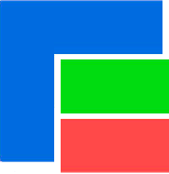
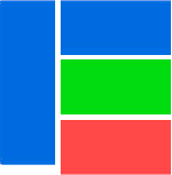
Absolute Positioning
You may have noticed that our output does not exactly look like our picture for this row (i.e. there are no green and blue squares inside of the purple square). These squares can be placed in a fixed location with the position propery and using the absolute value.
In order to use position: absolute, the parent must have position: relative or else the child element will be relative to the browser, which is not what we want because resizing the browser will cause all sorts of issues.
To achieve our goal, we will be adding new cells inside of our parent in order for them to be positioned absolutely with respect to the parent. We will create a .col-absolute class which will have the position property and we have it as a separate class because it will be reused by different elements that can be placed in different locations. Notice, we will also be reusing the classes we created earlier to set the cell height.
When an element is position absolute, there are 4 properties that will be used to in order to position them relative to its parent: top, right, bottom, left. In our example, we want them to be 25px away from the edge of the parent’s container so we will use top and left to position the top left element.
Another property that is often used in conjuction to position: absolute is the z-index property. This property defines the order the elements appear front to back; the higher the value, the further in front it will be. For example, an element with a z-index: 1 will be in front of an element with without a z-index but will be behind an element with z-index: 5. This can be seen in our example where we define the green cell first (therefore, making it appear at the very back) but tell it to appear in the front by giving it a z-index, which takes precedence over all of the elements without z-index values.
HTML [Show Setup]
<style>
    .row { width: 300px; }
    .row:after { content: ""; display: table; clear: both; } /* Clearfix hack */

    /* Height classes */
    .col-h-1 { height: 50px; }
    .col-h-2 { height: 100px; }
    .col-h-3 { height: 150px; }

    /* Width classes */
    .col-w-1, .col-w-2,
    .col-w-3, .col-w-4 {
        float: left;
        position: relative;
    }
    .col-w-1 { width: 50px; }
    .col-w-2 { width: 100px; }
    .col-w-3 { width: 150px; }
    .col-w-4 { width: 200px; }

    /* Color classes */
    .color-red    { background-color: #DB4A4A; }
    .color-purple { background-color: #DA4DC1; }
    .color-green  { background-color: #6DDB4B; }
    .color-yellow { background-color: #DADC4A; }
    .color-blue   { background-color: #4A6CD9; }
</style>
<style>
    .col-absolute {
        position: absolute;
    }

    .col-center {
        bottom: 0;
        left: 0;
        right: 0;
        top: 0;
        overflow: auto;
        margin: auto;

        z-index: 1;
    }

    .col-top-left {
        top: 25px;
        left: 25px;
    }

    .col-bottom-right {
        bottom: 25px;
        right: 25px;
    }
</style>

<div class="row">
    <div class="col-w-3 col-h-3 color-purple">
        <div class="col-w-1 col-h-1 col-absolute col-center color-green"></div>
        <div class="col-w-1 col-h-1 col-absolute col-top-left color-blue"></div>
        <div class="col-w-1 col-h-1 col-absolute col-bottom-right color-blue"></div>
    </div>
    <div class="col-w-1 col-h-3 color-blue"></div>
    <div class="col-w-2 col-h-1 color-blue"></div>
    <div class="col-w-2 col-h-1 color-green"></div>
    <div class="col-w-2 col-h-1 color-red"></div>
</div>
Output
Third Row
Lastly, comes our final and most difficult row. This is no different from the previous two rows and you should understand how it works. By putting all of these snippets together, you’ll be able to achieve our final product.
HTML [Show Setup]
<style>
    .row { width: 300px; }
    .row:after { content: ""; display: table; clear: both; } /* Clearfix hack */

    /* Height classes */
    .col-h-1 { height: 50px; }
    .col-h-2 { height: 100px; }
    .col-h-3 { height: 150px; }

    /* Width classes */
    .col-w-1, .col-w-2,
    .col-w-3, .col-w-4 {
        float: left;
        position: relative;
    }
    .col-w-1 { width: 50px; }
    .col-w-2 { width: 100px; }
    .col-w-3 { width: 150px; }
    .col-w-4 { width: 200px; }

    /* Color classes */
    .color-red    { background-color: #DB4A4A; }
    .color-purple { background-color: #DA4DC1; }
    .color-green  { background-color: #6DDB4B; }
    .color-yellow { background-color: #DADC4A; }
    .color-blue   { background-color: #4A6CD9; }
</style>
<div class="row">
    <div class="col-w-4 col-h-1 color-yellow"></div>
    <div class="col-w-2 col-h-1 color-red"></div>
</div>
Output
On Your Own
There is an assignment available on GitHub to practice what you have learned in this lesson.